CHILDREN’S BOOKS IRELAND Conference 2014,
24th May 2014, Lighthouse Cinema, Dublin Ireland
Transcript of talk and a few of the slides:
I FAIL BETTER ALREADY
Good afternoon.
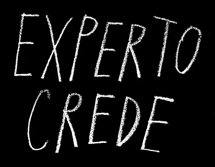
On my desk I have a little sticker saying EXPERTO CREDE, which translates to ‘ask someone who knows’. So when the CBI invited me to talk on the subject of failure, I felt a little uneasy. But that sticker is a little reminder to me that as an author, I know what I’m talking about when it comes to my books. And the emphasis is on my.
© david mackintosh
We go to extraordinary lengths to avoid making mistakes.
I wrote this all down so I wouldn’t forget what I want to say, or worse, say it out of order. The pictures behind me are on a loop because I knew I’d make the mistake of speaking out of synch with a structured presentation. I rehearsed this talk a couple times to get an idea of just how long it would take me to read because I’d hate to go overtime and infringe upon the coffee break, which to my horror has taken place before this. However, that would have been a big mistake. Nearly everyone likes coffee.
I even considered having an actor friend of mine perform this in her wonderful modulated voice so you wouldn’t have to endure my crude monotone, which is a combination of Australian and hayfever.
But that wouldn’t be me, and ultimately she would have eliminated any opportunity for beautiful mistakes or blunders. Which would also be a big mistake, because that’s what this is all about.
My subject here is failure and I’ll be discussing mistake-making and my chance encounters with mistakes that ulitmately make the creative experience so rewarding.
Failure is such a broad term. It’s a state of mind as much as it is a low-grossing film, a poorly run political campaign, not quite reaching the summit of Everest, or a remaindered book. I’d like to claim that I have experienced none of these things but happily I have. And mark my words: I will return to Everest if it’s the last thing I do. Everything I’ve done in my career has led to this point now where I am standing in public revealing things I did poorly to get here, or more to the point things that I could have done better.
Today, I want to talk about my everyday mistakes, oversights, miscalculations, faux pas, the lack of successes that sneak in, appear, become apparent or slap me in the face when I sit down at my desk to work on a picture book, (or anything for that matter). The trials and errors in making a drawing, and what happens when I discover something isn’t working the way it should. And how I’ve developed my working process to allow for these things and consequently learn from them.
I can’t claim to be the first to champion this method of self improvement/quality control. Consider what the American philosopher Daniel Dennett had to say:
“So when you make a mistake, you should learn to take a deep breath, grit your teeth, and then examine your own recollections of the mistake as ruthlessly and as dispassionately as you can manage. It’s not easy. … Try to acquire the weird practice of savoring your mistakes, delighting in uncovering the strange quirks that led you astray. Then, once you have sucked out all the goodness to be gained from having made them, you can cheerfully set them behind you, and go on to the next big opportunity. But that is not enough: you should actively seek out opportunities to make grand mistakes, just so you can then recover from them.”
(Daniel Dennett, American philosopher)
Then the author Neil Gaiman in his Make Good Art speech:
“…Because if you are making mistakes, then you are making new things, trying new things, learning, living, pushing yourself, changing yourself, changing your world. You’re doing things you’ve never done before, and more importantly, you’re Doing Something.… Make New Mistakes. Make glorious, amazing mistakes. Make mistakes nobody’s ever made before. Don’t freeze, don’t stop, don’t worry that it isn’t good enough, or it isn’t perfect, whatever it is: art, or love, or work or family or life.
Whatever it is you’re scared of doing, Do it.
Make your mistakes, next year and forever.”
(from Neil Gaiman, Make Good Art Speech).
Naturally, Samuel Beckett from Worstword Ho:
“All of old. Nothing else ever. Ever tried. Ever failed. No matter. Try again. Fail again. Fail better.”
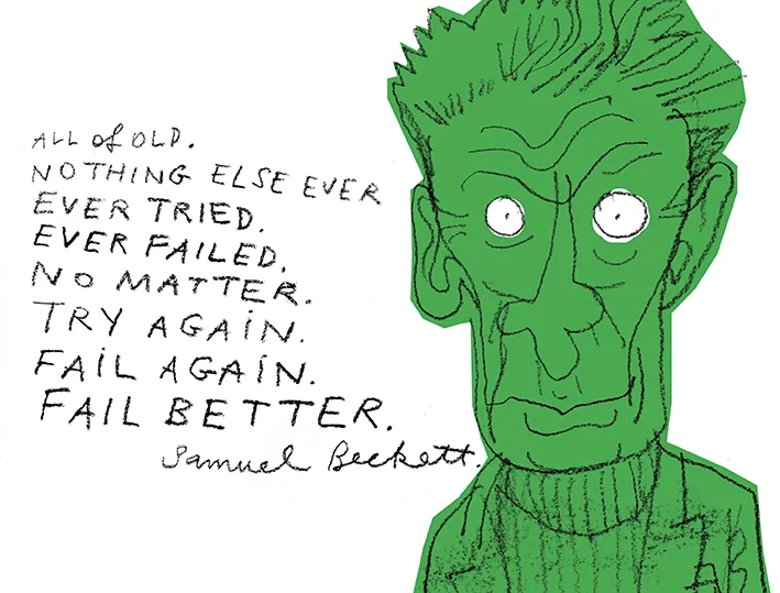
illustration © david mackintosh
Of course, I must include my high school football coach who instilled in me this attitude. Before each game he took all the forwards to one side and explained that if we each take ten shots at goal, one of them has to go in. In other words: don’t be precious, have a go. In practice, the philosophy generated many groans from the spectators, and a few laughs too, and has always stuck with me from those days, together with a fear of segmented oranges.
IS THAT ALL THERE IS?…
When I left high school I wanted to be an engineer, a mechanical engineer to be precise. I liked how things worked, and making things that work. My dad was a design draftsman and there was always a drawing board set up somewhere in our house, and a nearby table with pens, clutch pencils, French Curves, rulers and practical things like that. He’d show me how to fill the pens with ink and draw a straight line without a ruler. On weekends he’d take me onto half-finished tall buildings that he was working on and I’d get to wear a hardhat and tiptoe along narrow planks high above the ground and he’d point out different kinds of structural things and describe how they were built. Years later, when I started working in a drawing office on my way to becoming a draftsman, I’d sometimes find old drawings with my dad’s initials on them for a building that my company was now renovating.
But, thankfully, the dream of being an engineer was my first mistake. Three years into the job, I hated it. I was working during the day, and studying maths at night and in subtropical Australia during summer, the last thing I wanted to be doing after a long day in an office was trigonometry.
To make matters worse, I was sharing a house with friends who were at art school. I liked their lifestyle, which involved sleeping during the day and making things out of wood and paint in the evenings. It was always wood and paint. And there was lots of beer. I wanted to do that.
I didn’t do art at school, I did instead Modern History and Phys. Ed. and Health Science. But I did draw a lot. I drew in school books, I drew cartoons for people, I drew my own comic stories. So, with encouragement from my flatmates, I rounded up lots of drawings and bought a fancy black portfolio case and before long I had a portfolio of ‘work’. I took it to the art school, and got in.
A month later I realised that this was the place for me, that all that had come before this was good but not as good as this, and the contrast was amazing. And I had a lot of learning to do.
Working on different projects at art school is a great place to make mistakes. In the little bubble of the studio you can investigate what works and doesn’t for you, at no cost to anyone but yourself. Your reputation is safe for three or four years while you try to find a style you can work with, a voice that is yours, visually and narratively. Since leaving art school, I’ve never experienced anything as nerve wracking as The Critique, the weekly ritual where your precious work is under the scrutiny of your peers.
One of my tutors reminded me, when I drew an eye too much like a Ralph Steadman eye, that it was OK to do that. Because I should draw like that as much as I can to get Ralph Steadman out of my system, because others won’t be so forgiving out in the real world. (Especially Ralph Steadman, I thought to myself.)
DON'T BE PRECIOUS, PRECIOUS…
The American artist Debbie Millman says
“If you aren’t making enough mistakes, you aren’t taking enough risks.”
As a youthful designer in Sydney, I worked on magazines. The Monday morning creative meeting consisted of the art director and designers meeting and all the designers were asked to submit an example of a layout or design approach that looked cool, something gleaned from a rival magazine. Each designer would toss a copy of a magazine open at a page into the middle of the big white table and the AD would lean forward and either give it the nod and tell someone to go and copy the style in one of our magazines, or reject the idea for some reason or other. Often, the reason included the words ‘not funky enough’ or something like that.

© David Mackintosh
This is a good example of how not to take risks, and therefore how not to make mistakes. In fact, it’s a good example of not even thinking, if you think about it. I mean what if all our rival magazines went out of print? Where would we get our ideas from? But then, if that happened we wouldn’t have any competition so it probably didn’t matter that our layouts were rubbish. Look at the Yellow Pages for example.
Prior to that and straight out of uni, I worked at an ad agency where one of my specialities was making black and white product illustrations for newpaper ads, probably one of the lowest forms of the practice. This was before digital photography and 4-colour newspaper printing was in use. I would arrive at work to find bags of rice, beer bottles, creosote, thongs (for your feet) and cartons of orange juice on my desk. My job was to make black and white illustrations of them suitable for reproduction in one colour at very small scale.
Nowadays, you may just photograph the object and soup it up in illustrator or photoshop. But I would use a bromide camera, which is an oversized camera about the size of a Space Invaders machine but I didn’t need any loose change to operate it.
There was a platform below the camera that was lit with strong lights either side, and a large glass plate above the camera lens which showed the projected image from below. I could adjust the scale of the image by winding two handles. I’d then put photographic paper on this glass, shut the lid and switch on a vacuum pump, set the exposure and flick the switch. The lights would come on and shut down once the exposure was complete.
All this was taking place inside a darkroom, and I’d then take my bromide and run it through a developer and fix it and put it in the drying cupboard.
Using this photographic image of the product, I’d go to my desk and switch on my lightbox and through various stages using tracing paper, white out, blue pencil, Indian Ink I’d retouch the image to sharpen things here and remove things there. I had been through this process a thousand times with a thousand different products and was getting good at it.
I’d been through this procedure with a bottle of orange juice when the client arrived to see the illustration. He was shocked and said that it didn’t look like his orange juice bottle at all. At first I thought he meant that it was because it wasn’t orange, but that couldn’t be it surely. He explained that he thought it needed to be taller, that his product was taller.
I disagreed and explained that it was based on a photographic copy of the bottle and so everything was in proportion, save for a little distortion by the lens maybe, but not enough to be noticeable. He understood, but still felt that the bottle didn’t have the ‘feel’ of his orange juice, and insisted on changes being made in its height. After I’d made the changes he was very happy and left saying it was the best rendering of his orange juice he’d ever seen, and he let me keep the bottle as a reward.
This to me was a good practical experience about taking risks. I followed a proven method of replicating an object which ultimately was a failure in the eyes of the client. Something right was wrong, and something wrong was right. I think they call it artistic license.
ME-TIME…
But writing and illustrating picture books isn’t much like playing football, or orange juice. Thank goodness.
It’s not a team game for a start. One spends a good measure of time on one’s own forming the idea, writing the text and making the visual narrative. It’s not a book until then, it’s just an idea for a book. So I have plenty of me-time to make things work, or not work. To fail or not. To make my mistakes and to sit back in the privacy of my own studio and see what they are and decide why they don’t belong there.
When I get the seed of a story, I carry it around with me for ages, reading it out loud to myself in my head. It may just be a sentence that tells me what the story will be about, but I can’t let it go. Often, it’s a title that I think might be good: Marshall Armstrong Is New To Our School defined the story and I wrote it from there, with a little help from the memory of a classmate. Standing In for Lincoln Green arrived after noticing my friend’s daughter staring at her reflection. I work the idea over and over in a cerebral storyboard, a beginning middle and end before I go near a piece of paper or the laptop. I find that swimming, or taking a shower is best for this undisturbed thinking. There’s something about water that helps.

Image © David Mackintosh
By definition, publishing means sharing: to make public. It’s going to happen at some point, and as author I want to decide when. But I want to deliver my idea as effectively as I can, so it’s been through my own editorial process before anyone else sees it. I want to get my side of the story over first, I want that advantage before the input of others. I want to present the story in it’s purest form. And it’s my job to convince my publisher that it’s working.
By the time I’m sitting in the publisher’s office, it will be with the confidence that I’ve looked at my story back to front and inside out and that it works. That many of the mistakes will have worked their way to the surface, and will have probably been looked over for even better mistakes. That’s the theory, but it doesn’t always work that way.
WHAT A DUMMY…
When presenting a book idea for the first time I normally arrive with a handmade dummy book.
The dummy has a cover with nice matt lamination, just like the real thing might have, but it’s in black and white, nice black and white sometimes with tones of gray. It’s full of rough drawings of what I imagine the illustrations could be like scrawled over the nice white paper. And with nice black words set in my new favourite typeface. A typeface that may have cost me over £300 for the family.
I’ll present the book by reading it aloud as a picture book, as if to a class of children, but instead it’s usually adult women, (and yes, it is usually women). The advantage of this more mature audience is that they don’t start wriggling, staring at the ceiling or untying their laces. At least I don’t think they do, I’m trying too hard to read the upsidedown words.
And at this point, when I reach the last page, the book has been published. Published in it’s rawest form. Then the feedback comes, both good and bad. And people are only too happy to point out any inaccuracies, as much as they are to highlight successes.
If I’ve done my job effectively – convincingly – the book idea will be well received and the publisher will want to proceed to making the real thing. And to me, the fewer amendments required the more successful I’ve been in telling my story.
YOU'LL LIVE, IT’S ONLY A ROUGH…
But you must remember that at this stage people are only looking at roughs, not the finished book. And people can only go by what they see before them. So, if in one of my drawings a character’s face is slightly different, or there’s a line that runs into another line when it seems like it should stop, the publisher will probably question it, but I should be able to justify it. And my refrain is usually, “Oh, it won’t be like that in the real thing”. If there is a child with a particularly angry expression on it’s face in a crowd drawing, or a building with no windows… “Don’t worry, it won’t be like that in the real thing”. But then maybe it WILL be like that in the real thing. The reason is this…
I used to work in what could be considered an orthodox way. That is, I would pencil everything, then work over the pencil with ink, then add colour with paint or crayon or coloured pencil or whatever I may be using. Many people work this way, it’s very good because you can get the rough done, get it approved then go ahead and make it real.
One drawback to this is that the looseness inherent in the underdrawing often becomes lost when the ink drawing is overlaid and the pencil erased. Like driving a car around a tight circuit of traffic cones opposed to driving an old utility wildly around in a field. Some people get better results than others of course. But for me it was like drawing with my good hand behind my back.
The blank sheet of paper was another issue. Especially when the sheet of paper was made in France by a monk and cost £3 a sheet. I simply couldn’t afford to mess anything up, so having an approved pencil drawing to trace was a good thing. But I would sit with the pencil hovering hesitantly over the pristine paper, terrified to spoil it with a false mark or a sweaty palm.
But it didn’t take long to realise that what I liked about my drawings was just that, the drawings. The roughs themselves. And the only way I could retain the life that was in the drawings was to use them as they are: imperfections and all. So I resorted to using oil pencils that give a nice black line and started using paper that was half the cost of the nice stuff, but was a secular product.

Illustration © David Mackintosh
So now, when I sit down to draw I draw fast, on cheapish paper of which there is a stack on my desk beside me. And I draw until I get a drawing that works for me. Each one is as it left the pencil, unguided. This may take 2 attempts, or 12 attempts, but it doesn’t matter to me. I’m not governed by the beautiful paper, I’m governed by the look of the drawing.
These drawings become pieces of a bigger picture which I cut and paste together where necessary. This is then painted and coloured and then scanned when it’s at a point that I can’t work on it any further. Once I have the scan, I’ll mess about with it on my computer, erasing bits, cleaning out things and adding areas of mechanical tints, or extra drawing or afterthoughts.
Before I worked in this way, when I was working on the holy paper, I felt that if the illustration reproduced in the book wasn’t identical to what is seen on the paper, then I had failed. If I can’t put it all down in ink and paint in one go, then I’ve failed. If it can’t be put up in a frame in a gallery, then I’ve failed because it doesn’t represent my true skill and expertise as an illustrator.
I have a friend who doesn’t sell his originals, and doesn’t frame them because he believes the illustrations were made for reproduction in a book and that’s that. They weren’t made to be seen in another context, singularly. They are part of a visual narrative. They were made to be read with the text and seen within the medium of printed and bound pages. And basically I agree with him.
Similarly, I don’t feel the need to see all the unused scenes from a TV series, or the gag reel, to go beyond the mise en scene of the film. Or to see the director’s cut. Sure, it’s interesting and I’m curious (isn’t that what I’m doing here today?) but I resist the temptation where possible because it somehow detracts from the original. It’s somehow saying ‘but it could have been like this’.
Getting back to the process again, a nice side effect is that I have a drawer of discarded drawings which I often look back at and see where I was going wrong, see the mistakes I was making. And some of them are astoundingly bad. Terrible attempts at a hand or a dog’s leg or a mirror or a page composition that just didn’t work as well as the drawing I settled on. These superfluous drawings are my personal gag reel, but only funny to me, because they are the by-product of an editorial process that only I can recall, and something that is too much like navel-gazing when shared in public.
TRY IT, YOU MAY NOT LIKE IT…
Ed Catmull, a co-founder of Pixar commented:
“Mistakes aren’t a necessary evil. They aren’t evil at all. They are an inevitable consequence of doing something new and, as such, should be seen as valuable.”
Until I know what doesn’t work, I won’t know what does work.
I need to be convinced that a book idea is working and the best way to do this is to compare it to what doesn’t work. Roughs are a playground for this. It’s ok to do it all in the roughs, no one will be affected by it except oneself and the mistakes will guide you towards a more satisfying solution.
“Fail early and fail fast”, like someone said. And I can’t help but think of those Ralph Steadman eyes again.
Picture books, and I’m talking about picture books generally, are essentially 32pp. One has 32pp to tell the story, deliver the idea. But your idea may need 33 pages… too bad. The budget won’t run to adding an extra section if you only need one additional page. You have to work it out.
Storyboards are a bird’s eye view of my book. I fly over the story which is a black and white patchwork below me, laid out spread by spread. From above I see the structure of the book, the flow and composition all at a glance. I can see the text breaks, type placement and the volume of the illustrations. I can imagine the colour, the white spaces and all the things that effect the final artwork. And what’s more with a pencil I can change it, and adapt it, remake it and tighten it up, all at a small and manageable scale, on my table top. A fundamental change in the storytelling, can be achieved in a few strokes of the pencil, or snips of the scissor right in front of me and I can see the change in relation to all the other pages in the book.
I produce many of these storyboards (or thumbnails) when I work on a book. Each one develops based on the previous. For example, in my book Lincoln Green, I wanted from the beginning to have an image of Lincoln Green doing a handstand and it had to be a full page and there was no two ways about it. I got it to fourth storyboard stage before I realised the error in my ways and dropped the idea for something else which allowed a smoother storytelling. Sometimes I just want to draw a particular picture, but that’s not always good. The first idea isn’t always the best, but to find out one must throw in some alternatives to convince one of this. You’ve got to kill your darlings.
Like Thomas Edison said:
“I have not failed, I’ve just found 10,000 ways that don’t work”.
I have a feeling Edison just didn’t like the idea of saying the word ‘failure’.
So, being convinced that something works better than another way, for me, can only be realised by having a look at the alternatives. And it is such a satisfying process. Sure, it takes more time but it works and a bonus is I have proved to myself that one thing works better, and I can say that I know because I’ve been there, tried it and seen so.
LIKE IT’S GOING OUT OF FASHION…
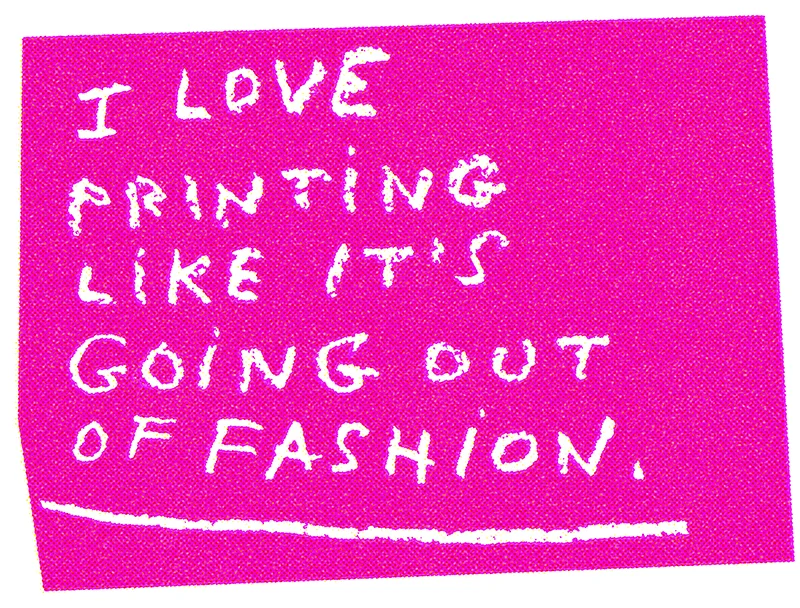
© David Mackintosh
Working in print is as enjoyable today as it was when I did my first book.
And the theory hasn’t changed much since the first book either. The standard picture book is still 32pp, it’s printed in ink on paper with offset lithography. Pages still turn the same way, the gutter is still in the middle, the front cover is always at the front and the end is still at the back of the book. And I still love that format.
I’ve described something of the circuitous route I take to realise a picture book and present a story. But there’s another area that fascinates me too and one that I can’t overlook.
As a print designer, the end product is printed paper. For all the formalities involved in preparing a book and artwork for print, the outcome is an array of tiny coloured dots on paper.
Nowadays, a lot of illustrators work digitally, that is they don’t supply original artwork for scanning. But, of course, that’s not always the case. Oh, and by the way, it’s been like that for 10 years or more, we all know that.
Generally speaking, if you supply reflective artwork it is down to the repro house to reproduce the artwork as closely as possible to the original, that's the default. And this means comparing the original to the proofs, and they are experts at it. If printers receive digital files from designers and don’t have a physical original to compare the print to, it’s more a case of wait and see what comes out.
But is being faithful to the original artwork all it’s cracked up to be?
In my case, I don’t think so. It comes back to being precious about things. To me, I take the first proofs on their own merit. If they look good, then they are good: That’s good enough for me! When I compare them to the originals and the originals look better, then I’ll question the quality of the proofs, and try and sort things out. Otherwise if it ain’t broke, don’t fix it.
Over time, I’ve learned that I can anticipate certain things in colour reprographics and compensate for these things when I’m preparing artwork, or typesetting some text. These things become second nature.
But the thing is, it’s not a science and subjective opinion plays a large part. I have a good idea these days of how my choice of colour and my design decisions will turn out before seeing the first proofs. A good designer should really, or they’ll be costing someone a lot of money. But there is a very wide tolerance and lots of factors come into play, and it’s reassuring to know that something I didn't anticipate could just be the something that makes the page extra special.
I JUST DON’T KNOW?…
When I began illustrating I was very conscientious about things. If someone sent me a text to consider, my first question would be “Am I truly the right illustrator for this text?” How high-minded is that!?
I would send texts that I loved back to publishers explaining that I thought someone else would do a better job than I could on this. I was being honest, no doubt about it. But was I taking risks? Was I learning?
If I listened to Neil Gaiman, Samuel Beckett, Debbie Millman and the man from Pixar I probably should have said yes to all those texts and more, and learned from my mistakes.
Problem is, with a story, if something feels right for me then I just know. Otherwise I let it slide.
If you give a text to five illustrators you’ll get five completely different interpretations of it, and if I was a publisher I’d love to have the luxury of doing just that, to investigate just who is going to be best for the story. It does happen of course, but the wonderful thing about publishers is that they have a foresight and vision that makes them single out an illustrator and a faith that they will come up with something special that is good for the story. And as an illustrator one has to rely upon that. After all, I don’t want to be in constant competition, I just want to make books.
With a picture book, there are many ways of telling one story, but as an author I have to settle for one, then move on to the next book. No one wants to see all my interpretations of telling one story. No one wants the ‘illustrator’s cut’.
Today, I’m writing my own stories and illustrating my own texts. At the moment, it’s a story about a bug on someone’s arm that just won’t get off, and that’s it. That’s all I have, but I like the idea, and I’ll carry that idea about until something else happens, specifically a beginning, a middle and and end.
My new picture book out this August is called LUCKY. It’s about a boy who makes a mistake by misinterpreting something, by not keeping his imagination in check. And he learns something from his mistake.
And I’m still making all my own mistakes. And the more I make, the better I get, because I can say that I’ve been there and tried that, and take it from me it’s not a good idea. And I can say that I’m looking forward to many more attempts, and hopefully some more picture books, secure in the knowledge that in the words of Oscar Wilde:
“Ambition is the last refuge of the failure.”